Application Management & Configuration
ExoSense provides administrators with many ways of configuration and branding the application for your company and use cases.
Theme
The branding elements of ExoSense can be configured using the 'Theme' tab.
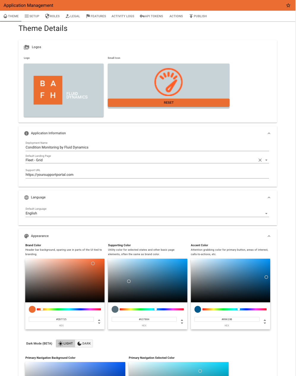
Logos
Logo
This image is used on the log-in screen.
Image File Recommendations
- Dimensions: 270x108 pixels
- Type: .jpg, .png
- Use a transparent background with a light text
- File size: 100 KB
- Note: Files that are different dimensions may be distorted
Small Logo
This is used for the browser tab icon (favicon) and also used at the top of the side navigation menu.
Image File Recommendations
- Dimensions: 64x64 pixels
- Type: .jpg, .png
- Should be a square image
- File size: 30 KB
- Transparent background (.png) is recommended but not required, but will leverage the side nav background for cohesive look & feel.
- Note: Files that are different dimensions may be distorted
Application Information
Deployment Name
Used in the browser tab and in places such as emails - essentially the name of your product.
Default Landing Page
Administrators can decide what the default page is when a user logs in. Typically is one of the Browse Views (Group, List, Map), but administrators may choose other options. End users can set their default landing page in their account preferences.
Support URL
This allows you to customize the 'Support Docs' link in the side navigation to use your own support or information site.
Default Language
The default language new users will experience when logging in.
Appearance - Colors
Allows for changing the Brand (header), Supporting, and Accent color for the header and a few other graphical elements in the application.
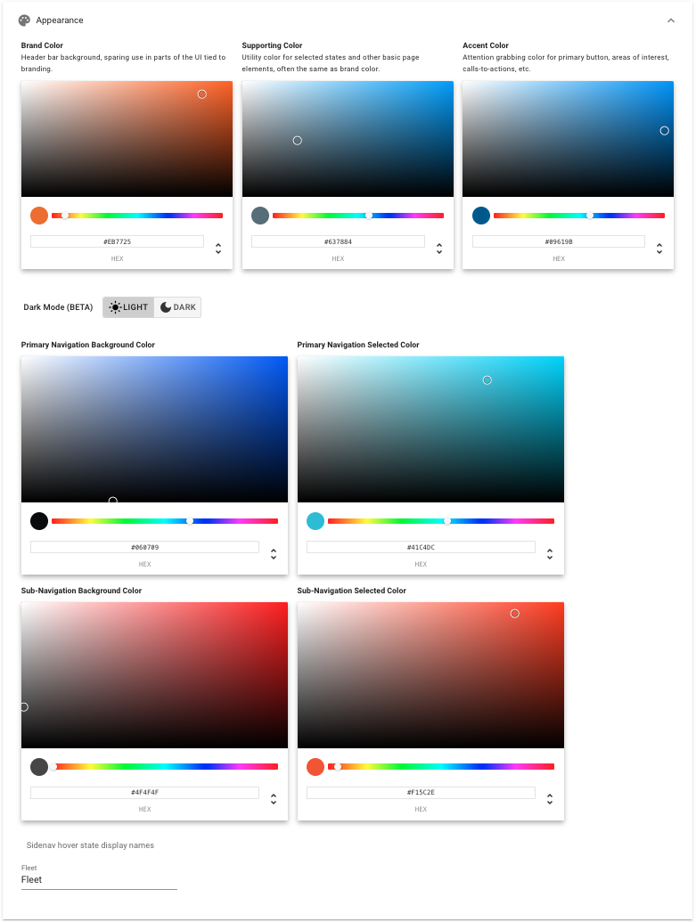
Theme Colors
| Color | Description of Use |
|---|---|
| Brand Color | Header bar background, sparing use in parts of the UI tied to branding. |
| Supporting Color | Utility color for selected states and other basic page elements, often the same as brand color. |
| Accent Color | Attention grabbing color for primary button, areas of interest, calls-to-actions, etc. |
Dark / Light Mode Theme (BETA)
Allows setting a Light or Dark mode as the default theme.
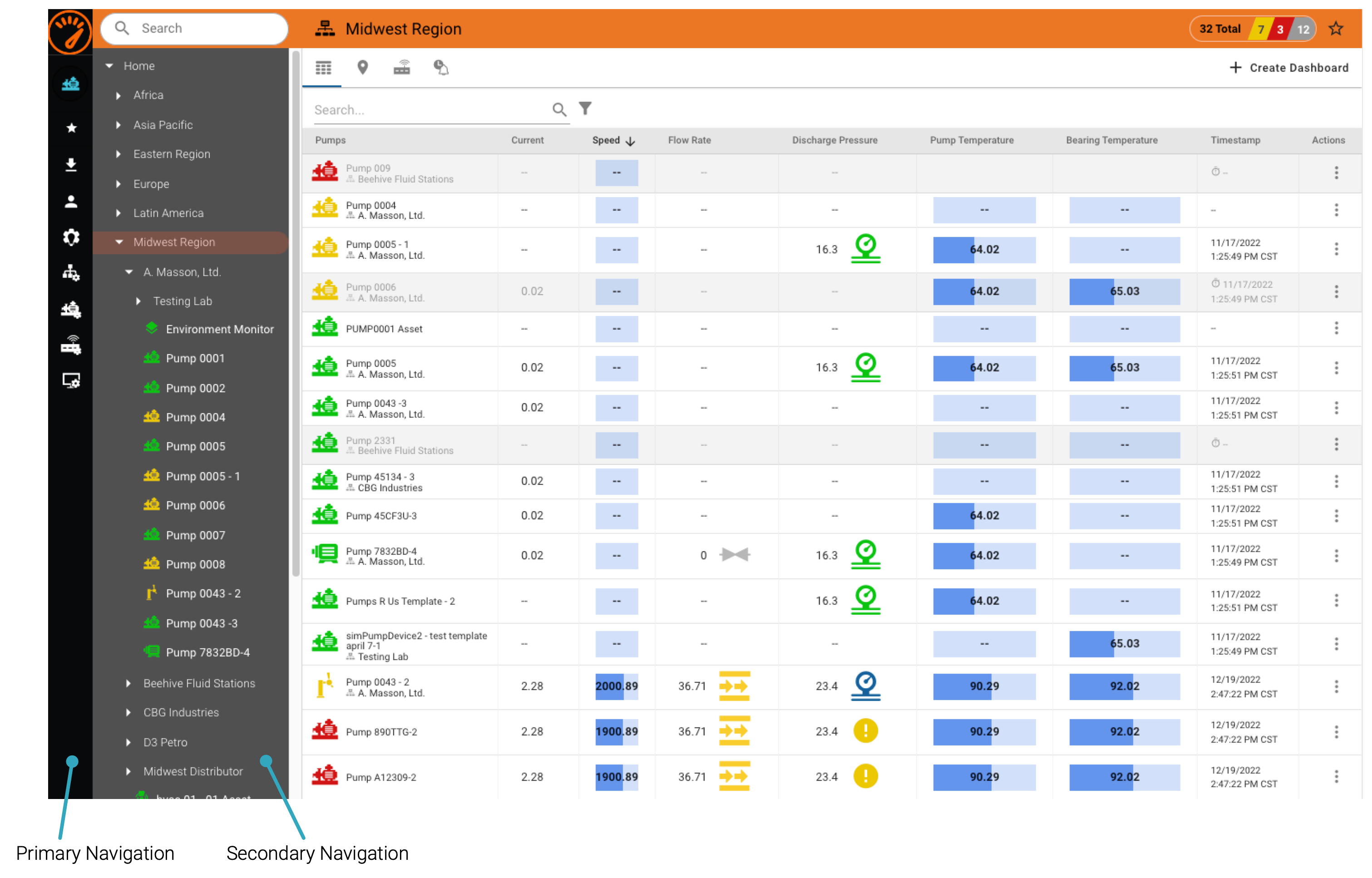
Navigation Colors
| Color | Description of Use |
|---|---|
| Primary Navigation Background Color | Main Side Navigation Background Color. |
| Primary Navigation Selected Color | Main Side Navigation Selected Color. |
| Sub-Navigation Background Color | Sub-Navigation Background Color. |
| Sub-Navigation Selected Color | Sub-Navigation Selected Color |
Appearance - Side Navigation Hover Fleet Display Name
The default for the Asset Grid / Fleet view on the left hand navigation is Fleet. This can be configured to any other String, such as 'Groups', or 'Assets', or 'Equipment'.
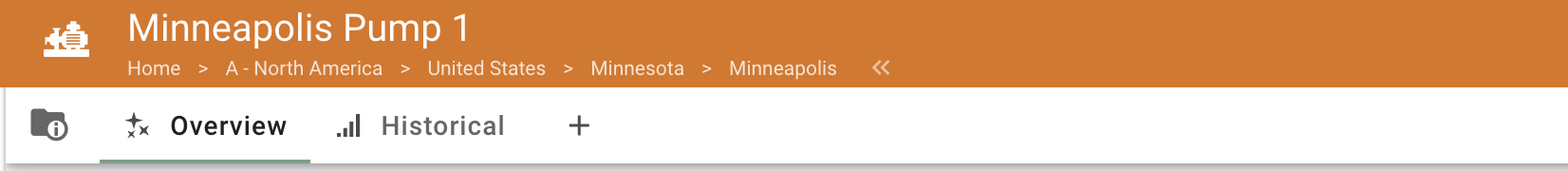
Appearance - Breadcrumbs
Navigation breadcrumbs may be enabled, which will display in the header on Asset, Group grid fleet views, and other pages in the application. These can be enabled or disabled with the Show Navigation Breadcrumbs in Header switch.
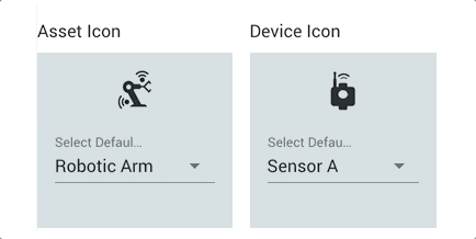
Default Icons
ExoSense uses icons for assets, devices, and groups anywhere there are lists or tables of these items. Knowing that there are very different types of assets being used, administrators can set the default icons used for assets and devices to correlate with the typical use case / equipment.
When creating or editing an asset, a different icon can be selected for each asset.
Group Icon
The default group icon is used when a group has not specified it's own icon.
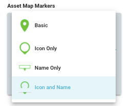
Asset Map Markers
Administrators may choose the style of markers used on Maps for Asset locations. When Name or Icon and Name are used, a setting for how long asset names are trimmed (when they do not fit in the available space) is also an option for assets with uniqueness in naming at the beginning or end.
Map with Name & Icon Marker
Map with Icon Marker
Page Export Options
When the Export Menu feature is enabled, the theme can control which export options are available to users. The export menu is available on dashboards, asset grid view, conditions, and maintenance work orders and typically found 'Export Menu' icon in the current view's header.
See specific pages for export details.
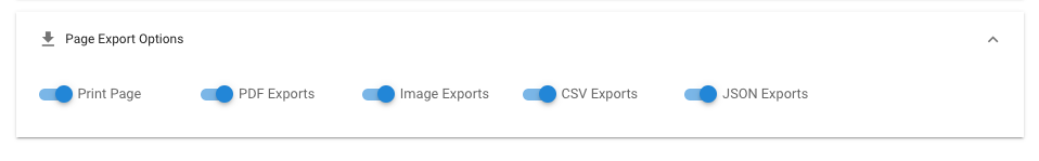
| Export Method | Description |
|---|---|
| The PDF export option allows exporting the view a single continuous view into a PDF file, which will be downloaded to your computer via your browser. You can choose in PDF mode to use page breaks and adjust the resolution. | |
| Image | The Image export options exports the current view as a single continuous image (.jpg). Image quality is adjustable as an option. |
| This will bring up the print dialog for your browser and computer. | |
| CSV | The CSV export will generate a single CSV fil based on the data currently in the view. Not available for all types of page views. |
| JSON | The JSON export will generate a file that contains the information in JSON format |
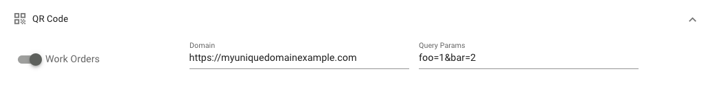
QR Code Customization
This allows for customizing QR codes in ExoSense, typically when an external application is expected to be used to scan the code to load the information. An example use case would be loading Work Orders in a Tablet/Phone or XR goggles system, with either a full custom domain and/or with additional query parameters. This feature to allow configuration of these QR codes must be enabled in the Application Management feature controls first.
Note that if QR codes are not customized here, they will work using the specific ExoSense's domain and parameters, linking to that object (e.g. a Work Order) back into the ExoSense application.
QR Codes supported
| QR Code | Description |
|---|---|
| Work Orders | Links to a specific Work Order in ExoSense. Default is |
Example
In this example, specifying a domain of https://myuniquedomainexample.com and query params of foo=1&bar=2 would result with a QR code like https://myuniquedomainexample.com?bar=2&foo=1&jobId=1a2ef1f1-ec9b-4a82-9003-22750ee0a512for a work order. The jobId parameter is always provided by ExoSense. )
Legal
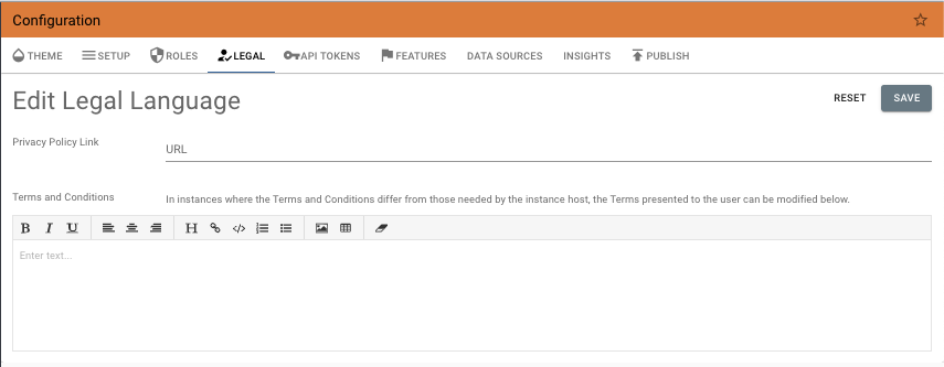
Terms & Conditions
ExoSense has default Terms & Conditions which can be found on the Log-in page. These can be modified and are agreed upon when a new user logs into the application.
Privacy Policy
The privacy policy URL is provided, once set, will show up on the log-in page.