Panel: Bar / Mixed Aggregation Chart 
Overview
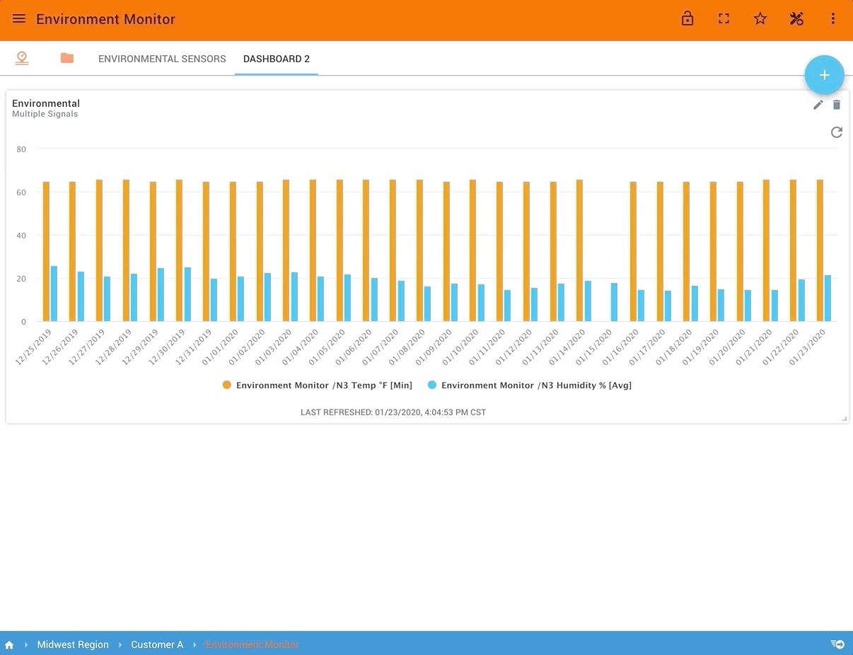
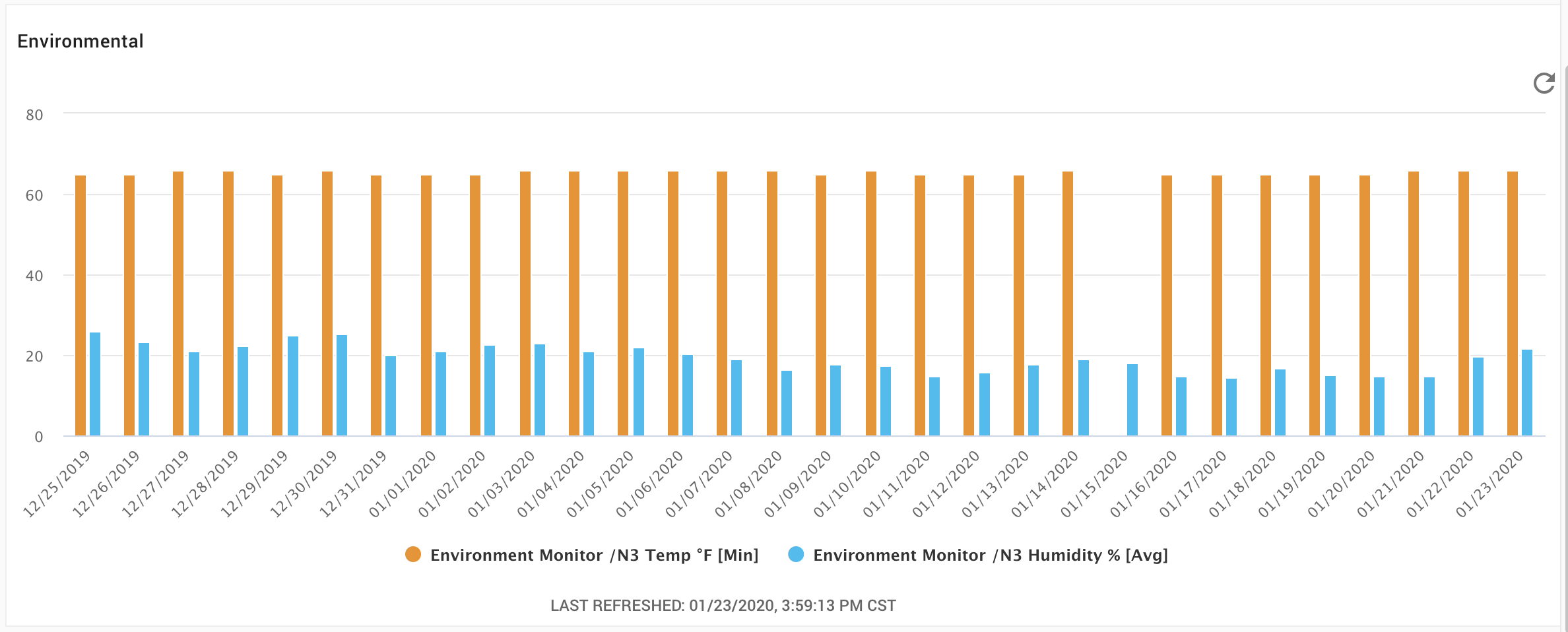
This mixed chart panel allows users to visualize aggregated data over time windows as columns (vertical) or bars (horizontal) or as a mixed chart of types connected lines, scatter (points), steps, or area. Data is aggregated using one of the following calculations: average, minimum, maximum, sum, or a count of times received. Overall time range and time window duration are both customizable.
The chart loads data when the dashboard loads but does not automatically refresh. A refresh button is provided for the user to refresh the chart.
Functionality
- Display multiple series simultaneously
- Configurable time periods and windows for data aggregations
- Supported Time Aggregations: Avg, Min, Max, Count, Sum, Diff (Max - Min), Diff (Last - First)
- Supported Range calculations: Range (Max - Min), Range (Last - First)
- Supported Mixed Chart Types:
- Bars / Columns
- Horizontal Steps
- Connected Lines
- Area
- Scatter points
- Configurable legend, series colors, series names
- Supports a static baseline
Configuration options
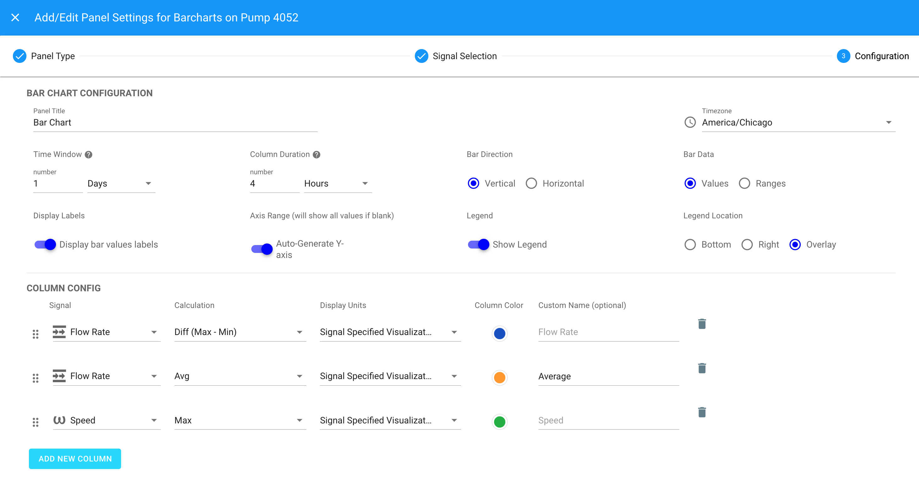
| Configuration Item | Description |
|---|---|
| Panel Title | The name the panel will use. |
| Time Window | The overall time used to aggregate data for each signal column. |
| Timezone | The timezone used for the time window and column times. Note: Will not change based on the dashboard viewer. |
| Column Duration | The time period size for each column (must be smaller than the Time Window) |
| Bar Direction | Vertical (Column) or Horizontal (Bar). |
| Bar Data | Whether to show the column as a signal Values or as a Range. |
| Display Labels | Option to show the values as labels on the column. |
| Axis Range | Options are to auto generate the Y axis or specify a Min and Max. |
| Legend | Option to disable / enable the series legend. |
| Legend Location | Option on the location of the series legend. |
| Display a Static Baseline | Enables the baseline configuration parameters. |
| Baseline Number | A static numeric value for the horizontal baseline. |
| Baseline Signal Units | Pick one signal series as reference for units for the baseline. |
| Baseline Color | Choose the color for the baseline. |
| Baseline Name | Specify a name to use as a label on the baseline. |
| Baseline Position | Option to set the baseline in the back or in front of other series. Default is Back. |
Up to 10 signals may be used in this panel.
Column Config
The following are available for each column.
| Configuration Item | Description |
|---|---|
| Signal | Choose which signal will be used for the column calculation. |
| Custom Name | Optional name that will be used for the signal instead of it's name with the calculation |
| Ordering | Columns can change ordering by dragging |
| Calculation (Values) | The function to use to aggregate the data for each column [ Avg, Min, Max, Count, Sum, Diff (Max - Min), Diff (Last - First) ] |
| Calculation (Ranges) | The function to use to aggregate the data for each column [ Range (Max - Min), Range (Last - First) ] |
| Display Units | The unit conversion to use from the selected signal. Default 'Signal Specified Visualization Unit' (recommended). |
| Column Color | Color used by the series column / bar |
| Type | Choose from Columns (default), Area, Connected Points as Lines, Scatter, and Horizontal Steps for the series plotting. |
When using the Ranges bar data option (rather than Values ), only the Columns type of series plotting is available.