Panel: Simple & Complex Line Charts
The Line Chart panel plots one or more numeric signals as series on a line chart. The panel is presented as two starting options - simple or complex to help with the numerous configuration options. Visualize multiple signals against thresholds and baselines over configurable periods of time.
Simple vs Complex Line Chart
The Simple and Complex line chart panels are exactly the same but have different default options enabled as a starting point.
Both panels support 1 or more signals.
Down Sampling
This Line Chart panel automatically uses down sampling except in the Live time window.
Key Functionality
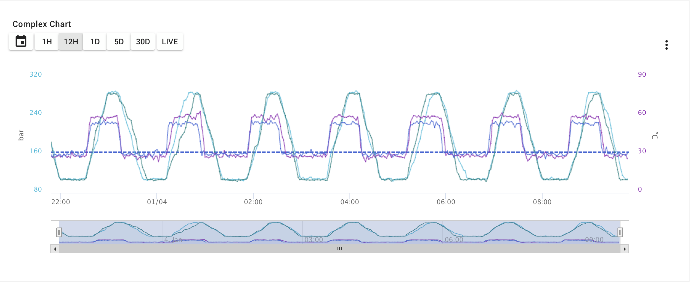
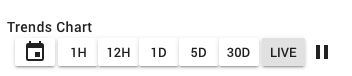
Time Window Selection, Live data, Pan and Zoom
Provides configurable selection buttons for quick access time period windows. In all time modes and Live mode data is real-time updated and can be paused. Optional Timeline navigator, X and Y axis zoom options.
Down Sampling
When using a time window selection, data is down-sampled when the time period of view's sampling size is longer than the the actual data reported rate. Live mode does not down sample. By default, sampling uses an Average value for the time slice, but each signal series can independently be configured to use Min or Max instead. Min and max envelope bands can also be enabled as an option in the configuration or in the panel's viewer menu. As you zoom, the data in the zoom window is re-sampled to get a higher resolution for that time period.
Compare Multiple Signals
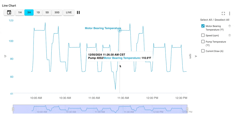
Supports multiple signals and ability to hover over points to get values.
- Recommended for 20 or less but supports up to 50 with lower performance / usability.
- Number of signals is also limited by signal types, up to 9 different data types can be used.
Axis Flexibility
Supports multiple Axis, based on Data Types or create custom axis and assign signals to these. The default is an axis for each Data Type, so for example 4 temperature signals would use the same axis. Creating a custom axis allows separating these signals say for different temperature scales.
Highly Configurable
Signal name, color, axis, ordering along with the legend viewing are all configurable along with setting features as default on load.
Baselines and Rule Threshold Lines
The panel allows the ability to show a signal's baseline property and to display Signal Threshold Rules as lines and vertical bar periods.
Export and Full Screen Mode
The panel's view menu allows export as a CSV file or XLS file from the data in chart. The line chart can also go full screen for more in-depth analysis.
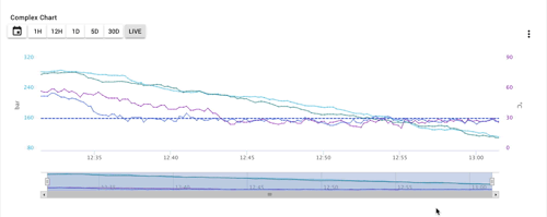
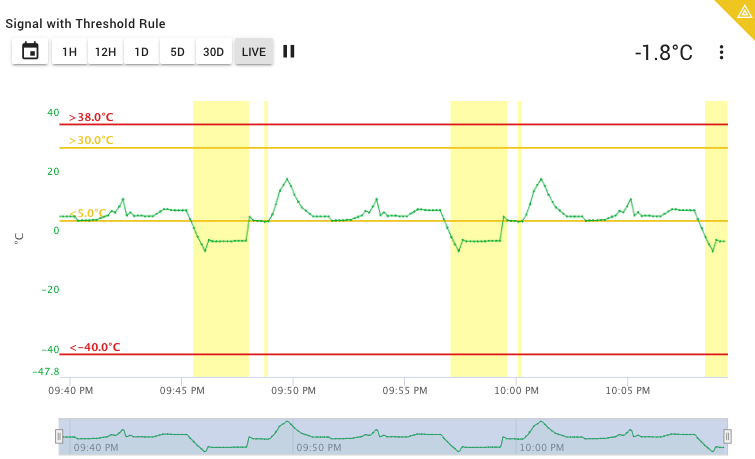
Example - Multiple Signals, Thresholds, and Legend
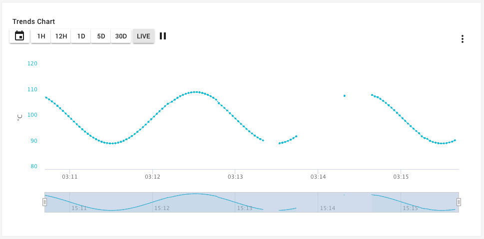
Example - A single signal with last value shown
Configuration options
Data Selection
The complex line chart supports up to 20 signals which can be selected on the Signal Selection step.
Default View Options
| Options | Default | Description |
|---|---|---|
| Panel Title | Chart | Name in the dashboard panel header. |
| Default View | Live Mode | The default time window selected. |
| Live Mode Time & Points | 30 Minutes -- 500 Reported Data Points | In Live Mode time view, specify the max number of minutes or hours and max number of points to show. Note that the max is 8 hours and 1000 points. These are configurable based on the fact different signals have different report rates. |
| Display Horizontal Grid lines | Off | When enabled, shows the horizontal gride lines. |
| Display Legend | Off | When enabled, shows a legend for the signals on the chart. |
| Overlay Legend | Off | When enabled, the legend will show up as an overlay that may be expanded/collapsed. |
| Enable Y Axis Zoom | Off | When enabled allows zooming in the Y axis, otherwise zoom only works on the X axis. |
| Show Timeline Navigator | On / Off | Shows a timeline navigation panel at the bottom of the chart for zooming and panning. Default on for complex, off for simple. |
| Display Min/Max | Off | For all Time Modes except Live, data is down-sampled. If enabled, this will show the minimum and maximum values during the down sampled periods in addition to the average. |
| Show Asset Names | Off | When enabled, will show each signal's asset name in the legend. |
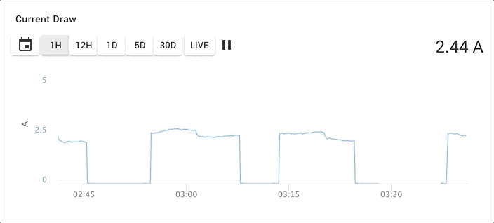
| Highlight Key Signal | On / Off | Will show a specific signal's last value at the top of the chart and optionally units at the top of the chart. Optionally can hide if signal is past its timeout setting. |
| Data Gaps | Off -- 3 times the report rate | When enabled, will show gaps in lines when the data points are greater than the number of times the report rate set. |
Time Navigation
Allows setting up to 5 selectable time period window buttons in the chart in addition to Live mode.
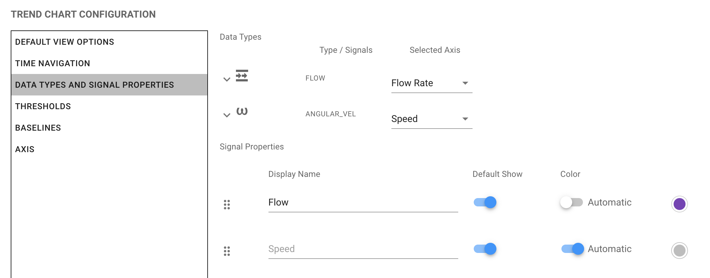
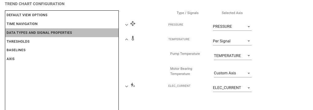
Data Types & Signal Properties
For all of the signals in use on this panel, you may specify an Axis for each Data Type or in the case of multiple signals of the same type, allow choosing the Data Type axis or a Custom axis.
For each signal metric on the chart, the following options are available.
| Option | Default | Description |
|---|---|---|
| Display Name | The signal's name | This allows changing the display name of this signal in the legend. |
| Order | Using the to drag, signal order can be changed here. | |
| Default Show | Enabled | Signals may be set to not enabled when the panel initially loads |
| Color | Automatic | To pick your own colors for signals, turn off Automatic and choose a color. |
| Primary Series (Downsampled) | Avg | Controls how this signal's data is aggregated during down-sampled time periods. Avg (default) uses the average value for each sampled slice; Min uses the lowest value; Max uses the highest value. This setting has no effect in Live mode where data is not down-sampled. |
| Line Type | Connected Points with Lines | Controls how this signal's data points are rendered. Connected Points with Lines (default) draws a continuous line between data points. Steps renders the data as a step-function, holding each value until the next point. Individual Points shows each data point as a discrete marker without connecting lines. |
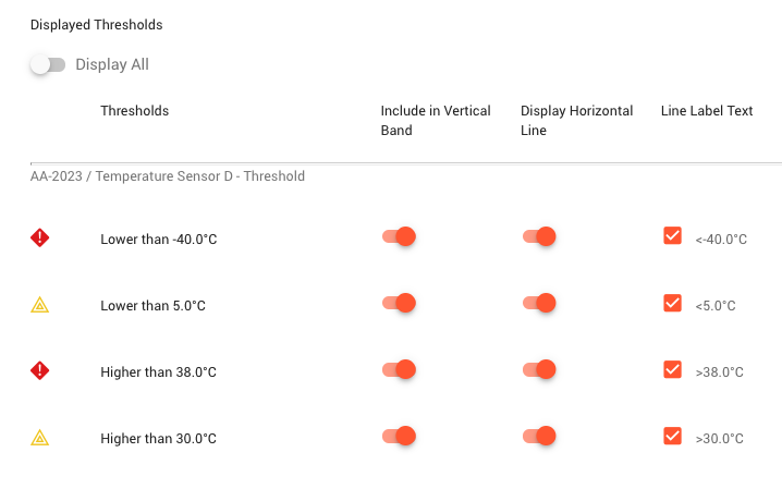
Thresholds
This configuration tab provides a list of threshold rule warning and critical thresholds found for each signal in the line chart. Users can choose to enable by default the threshold as a Horizontal line, use automated label or custom text on the line, and to show vertical bands for when the signals have been in warning and critical states. See Asset Condition Rules for more information.
Note that threshold rules for each signal will be able to enable/disable if discovered from the line chart's legend using the icon.
Options for each signal rule threshold states.
| Option | Default | Description |
|---|---|---|
| Include in Vertical Band | Off | Shows the status as a vertical yellow (warning) or red (critical) band on the chart. |
| Display Horizontal Line | On | Whether to show by default on panel load the specific threshold as a line on the chart using yellow for warning and red for critical lines. |
| Line Label Text | Checked | Checked means it will automatically use the type of threshold and the value to set the label on the threshold line. Example: >40.0°CIf it is unchecked, you can specify your own label text. |
Baselines
Allows setting a baseline horizontal line for the chart, for one signal, if any of the signals have a baseline property set. The baseline will be shown as a static dashed line.
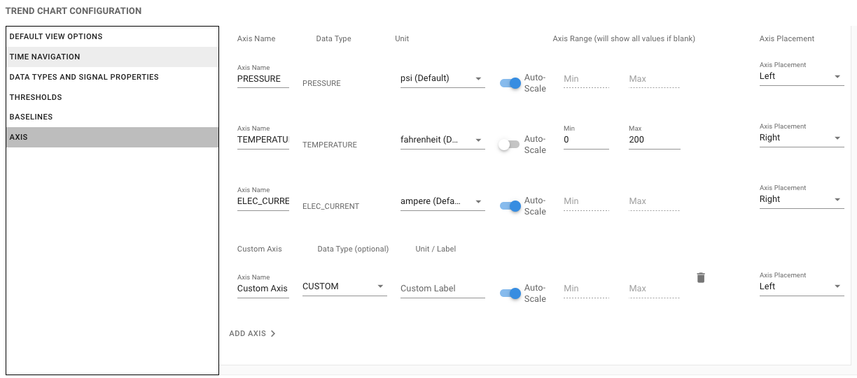
Axis
By default, the panel will create a Y Axis for each Data Type represented for all the signals. For example, if there are two Pressure signals and one Temperature, two Axis would be added. This can be customized under the Axis configuration. For each Data Type axis, the units, name, scaling, and left / right placement can be changed.
Axis Ranging
By default, each Y Axis will 'auto range' based on the current data set. This can be disabled per axis. One or both of the min and max can be provided to set a range. If left blank, that min or max will auto-scale. As an example, if the min should always be 0, this can be set while leaving the max to auto-range.
How Auto Min/Max Works
When an axis is set to Auto, ExoSense uses the following logic to determine the axis range:
- Thresholds are configured on the axis: The auto range considers all threshold values and sizes the axis to fit them, with a small 10% padding added for visual breathing room.
- No thresholds are configured on the axis: The axis fully auto-scales to fit the visible data.
In all cases the axis will expand beyond the computed range if actual plotted data would otherwise be clipped.
You may also add a custom axis which can be used for signals with custom numbers or to allow two (or more) signals of the same type to have different axis - for example because of scaling.
The Axis units may use the default Signal Specified Visualization Units (recommended) to dynamically adjust based on the user or choose a specific unit.
Same Data Type, Different Axis
When there are two or more Signals of the same Data Type, you may choose either the Data Type axis or a custom axis.
Live Data Mode
The complex chart include a live mode which pulls non-sampled data from the signal history, limited by number of total points (500 to 1000) and time up to 2 hours. The chart will never grab more than the number of points set to be sure the data is not down sampled. The chart auto refreshes as new values for the signal come into the platform.
Line Gaps
Line gaps are configurable. The default is 3-times the report rate for the signal being displayed, if the signal has a report rate property set. The gap rate can be changed from the default 3x duration in the chart's configuration to a different time multiplier.
Timeout Handling
If the signal being displayed has a timeout property set, the chart will grey out if the last reported value is longer than the set timeout property value.
Export Chart Data
The Complex Line Chart allows users to export the data currently in view in the chart. Note that this data may be down-sampled based on the time window. For a full resolution export of data, please use Reports & Exporting.
Full-Screen
Clicking the icon in the upper right corner will allow the chart to go full-screen. Clicking the esc keyboard button will exit full-screen mode.
Thresholds
Signals that have threshold rules may have their thresholds shown as lines on the chart. The configuration allows 1 or all thresholds to be plotted for each signal on the chart. The threshold label text can also be configured or left to be automated.
Warning/Critical Thresholds Lines Shown

Warning/Critical State Vertical Bands Shown
Threshold Configuration